 stanford
 linkden
 github
 goodreads
 medium
 twitter
Many default PowerPoint themes are too outlandish and graphics heavy for my taste. So over the last year or so, I have begun designing my own themes for PowerPoint. I'll go over the design decisions behind a couple and provide links to download the themes.
Many default PowerPoint themes are too outlandish and graphics heavy for my taste. So over the last year or so, I have begun designing my own themes for PowerPoint. This has allowed me to tailor a theme that suits the particular presentation style and audience. While there has been a trend toward a modernist style and a focus on just title, chapters and text aspects of each theme (instead of including designs that accentuate photos or other content), this is only the beginning. Several themes will be outlined and links to download them are included at the end.
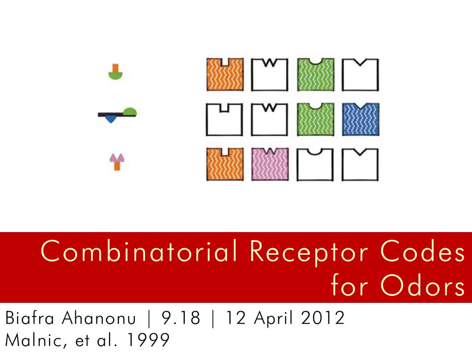
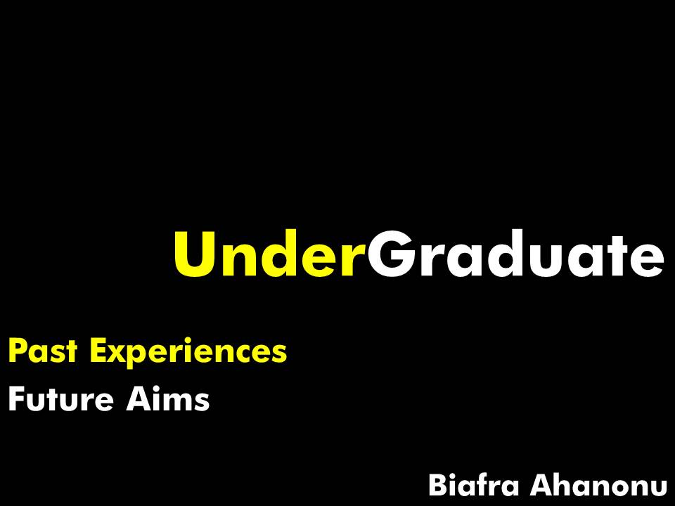
BWR Modern is a simple theme in the modernist vein. It is clean, bold and effective. The clutter is reduced and the use of white, black and red exclusively keeps the focus on the message and the content, leaving the theme as a secondary aspect of the presentation, as it should be. The ample white space encourages the use of large text to convey concepts, simple or complex, with the brevity required of a electronic slide. Adequate space is provided for images, videos or other content and allows them to breath. BWR Style is the predecessor of Modern and follows a similar style. It was made for an presentation of Malnic (1999), a foundational paper in olfaction, in a developmental neurobiology class.
Americana in Blue was built in response to the Captain America movie. The movie itself is great for its ability to acknowledge what it is--a campy, fun, B-movie--and play the part without attempting to veil things with a unnecessary seriousness. This theme aims to cover the same ground. The colors are unflinchingly patriotic, but there is a slight humour about the design, from the obnoxious use of the American flag as a title page to the shadows and white borders that give the whole theme a cartoon feel.
The Transitions series all have different looks and feel, but they focus on one key aspect: the use of a navigational bar on the top or bottom to orient the reader in the presentation. Transitions One was originally designed for a presentation at Janelia Farm on July 6th. Transitions Two, Three and Four were also designed for Janelia presentations, from journal clubs to lab meetings.
Impressions was designed for my graduate school presentation to Karl Svaboda, Tim Harris and other group leaders at Janelia Farm. Yanone Kaffeesatz and Futura are the sole fonts used and they contrast quite nicely. Yanone has a playful feel to it and goes well with the warm colored slides it is paired with. Futura conveys authority, a child of the Bauhaus design school. Thus, the presentation or section titles stand out and it helps break up the monotony that Yanone alone would otherwise create. Impressions Sans is an alternate theme that focuses exclusively on Futura and was used for a paper on Cer, a protein involved in early embryonic development. Impressions BB or Impressions Beige and Black, is a alternate theme that focuses on the nice contrast between the two colors and was used for a presentation on neuronal migration.
zStanford is everything the name implies, a homage to the school's colors. Sabon is the signature font that lends a classical feel to the presentation while retaining the modernist trend with sharp, clean lines. It is possible in the future that a more dynamic theme, with a use of more complex shapes and rounded corners or flowing lines, would do greater justice to the colors and font.
zMIT is a theme based on BWR Style but builds on it with a stronger focus on the three color theme and a attention to edges and setting the font right. Futura once again takes center stage. The contrast between black and red can be exploited to great effect and with proper cropping and alignment of images, it can be used as a eye-catching, but not overly intrusive, backdrop during a discussion.
Those are a small sampling of some of the themes I have created recently. The goal in the future is to further refine the BWR series and other themes. I will then branch out to create themes that fit certain eras or styles, such as one that can be used for presenting science to students that is a throwback to 1950s era popular science covers.
Download themes below:
Americana in Blue
BWR Modern
BWR Style
Impressions BB
Impressions Sans
Impressions
Transitions Four
Transitions One
Transitions Three
Transitions Two
zMIT
zStanford
![E�m�a�i�l� �S�i�g�n�a�t�u�r�e�s���19 October 2011 | designsSome people have long, obnoxious email signatures. This is my response[...]�.���](../../design/?picture=emails.jpg)