 stanford
 linkden
 github
 goodreads
 medium
 twitter
How do you design an icon for a website? This question arose once I'd finished writing the back-end of this website. There is a great book called Creative Workshop: 80 Challenges to Sharpen Your Design Skills that helped me answer this question.
This essay focuses on the icon I designed for the website and the thinking process behind it.
How do you design an icon for a website? This question arose once I'd finished writing the back-end of this website. There is a great book called Creative Workshop: 80 Challenges to Sharpen Your Design Skills that helped me answer this question. It contains many challenges that focus on specific design skills, from designing icons to creating a typeface. Each challenge has several criteria, hints that may lead to desirable results and, most importantly, a time limit. The time limit might seem arbitrary, but sometimes people over-analyze their work, which leads to unnecessary additions and tweaks. This results in added clutter and a deviation from clear design. The very first challenge involved designing a personal icon, one that represents the designers personal website or other endeavors. This was a good chance to refresh the confusing, uninspired icons I had made previously.
Having chosen the challenge, I completed it using scratch paper and avoided using a computer. There are several reasons for this. You can scribble, re-write, cross-out and do a multiude of other things rapidly on a piece of paper that don't come naturally on a PC or tablet. The need to only use a pen and paper brings focus on the ideas rather than the tool used to create the content. Often, when working at a computer, it is easy to get stuck in the specific, technical details that using Photoshop, gimp or other programs entail. The big picture, how the design comes together as a whole, disappears and the focus becomes pixel pushing and making sure everything is centered just right. This doesn't happen with pencil and paper.
Before even beginning to sketch, I outlined several pieces of information that would help define the icon. I initially wanted to convey several things in the design: rapid improvement of ideas, sense of color (to a degree, haha), and clear purpose. These would guide the form and essence of the design, it was meant to be forward looking and stylish. To this end, the main colors employed were white, black and red, as they have good contrast. With this in mind, I focused on what content the site would contain: short stories, essays, and posters. This lead to the realization that the majority of the content was less about current events and more conceptual. With the short stories, I often focused on unusual, otherwordly events. This lead to a focus on a sci-fi inspired icon. And to find inspiration, I jotted down several designers whom I admire, e.g. Massimo Vignelli, Robert Bringhurst and Khoi Vinh. Vignelli has used the grid system in amazing ways, see his Unigrid work for the National Park Service or his NYC metro map. Bringhurst has done some amazing typography work and his book The Elements of Typographic Style is a classic. And Vinh has succesfully applied the grid system to the net. With these things in mind, I had a better idea of where the site would be heading, how the icon would look and what has influenced me. I could thus begin designing an icon.
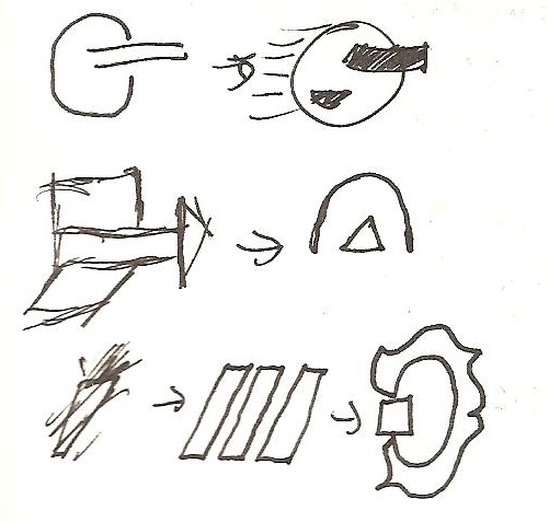
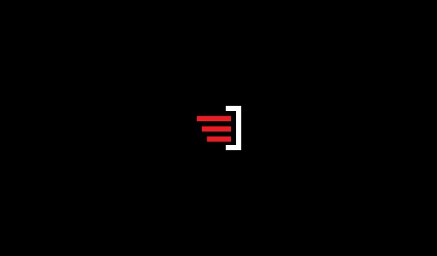
Several early designs were a bit too radical. They were very cluttered and I realized that for an icon to be useful, and portable, it needed to be very clear so that it could be shrunken to 16x16 pixels or blown up to 256x256 pixels and still retain its clarity and message. The current design was thus born. After sketching the idea, I settled on three bars, which simulate movement (the idea of improving and moving forward) while also adhering to my love of the number (e.g. I only use three colors on this site). The additional reverse C shape on the right helped capture the sense of motion and provide a third element (the number again!). This allowed me to easily incorporate white, black and red into the design, each with its own element (bars, background and reverse C). I then opened up Paint (simple, no distractions!) and made a 16x16 design. With no aliasing turned on, this lead to clean lines and subsequent enlargements retained this clarity. The design felt bold and captured the site's essence: slick, sci-fi-ish and future-orientated.
The design may be reevaluated in a couple months or after I've done some searching to make sure that a similar icon isn't already in use. Either way, the process going into making the design taught me a lot. However, learning is never finished and I look forward to reading works like The Icon Handbook, a recently released book on the subject, to get a better sense of good icon design. Can't wait!