 stanford
 linkden
 github
 goodreads
 medium
 twitter
To visualize the nighttime lights of Eastern Europe, with a focus on times before and after the ongoing Russia-Ukraine conflict, I updated my geoSatView R code originally built to view forest fires in the west coast of the United States to use satellite data from VNP46A1 and other datasets collected from the Suomi NPP VIIRS satellite.
I then created higher-quality movies in MATLAB by using the VNP46A2 Black Marble dataset collected by the same satellite, which has reduced cloud and other artifacts due to additional data processing. This allowed me to quantitate a permanent reduction in nighttime lights within Ukraine (in line with my initial hypothesis) and identify a multi-stage reduction of nighttime lights in Kiev's outer neighborhoods/metropolitan area that was greater than that seen in the city core/center. This highlights the utility of public satellite data to quickly test hypotheses and visualize large-scale changes.
I will go over how the Black Marble dataset is collected and processed along with how I created the movies and the advantages/disadvantages of each data source.
Using this platform and codebase, in follow-up posts I will look at 2021 Texas power crisis during the winter storms, vegetation changes in deforested areas or after conservation efforts, and other events.
Rationale and hypotheses
We live in an amazing, data-rich era, where many hypotheses can quickly be tested and new insights gleaned. For example, publicly available satellite data can be used to see large-scale dynamics at work, from the onset of forest fires and the spread of the resulting smoke to changes in forestation or availability of power/electricity. This later variable is one that I have been interested in looking into more, as I have already use satellite data to look at forest fires and smoke previously (see geosatview: creating videos from satellite data). In part, I wanted to get first-hand experience for where this data is located, how it is created (which is often just as [if not more] fascinating that the result), and ways to use it to analyze specific phenomena or changes after certain events. Further, this was a way to gain additional flexibility when wanting to make customized geographic information system (GIS) graphs and analysis that might be difficult or impossible to easily answer with existing tools.
While there have been multiple recent events around that world that might lend themselves to analysis of the sensitivity of satellite data to detect changes in power consumption/availability, the ongoing conflict between Russia and Ukraine appeared to be a great way to test this given that there is a clear causal variable, namely the February 24th, 2022 date that Russia invaded Ukraine.
Given the bombing campaigns that at times targeted the electrical grid (see Ukraine's Electrical Grid Shows How Hard It Is to Escape from Russia's Grasp), the assumption I had going in is that the overall intensity of light being emitted from within Ukraine would decrease. This would be further bolstered by the fact that Ukraine might not have complete integration of its electrical grid with other (non-Russian) countries and thus would not be able to restore power to the same degree given ongoing disruptions. In contrast, I expected nighttime light from nearby countries, such as Poland, to remain stable throughout this period, further indicating that the effect was specific to the conflict and not general changes in the energy landscape (given sanctions and other disruptions that were happening in Europe specifically and worldwide at the time).
It turns out this initial hypothesis regarding Ukraine's electrical grid was on the mark, as noted in a Times report (Grid synchronisation with Europe):
Called an Isolation Test, this requirement is the actual de-linking of the Ukrainian electricity system from Russia for a few days to see how it goes. It was scheduled for February 24, 2022, the day Russia invaded. The de-linking happened on schedule. Ukraine’s grid was disconnected from Russia and it survived in perfect working order, with no evidence of disturbances.
Supposed to be just a couple of days long, the Isolation Test has now left Ukraine’s grid stranded. Ukraine is unable to connect with Europe because ENTSO-E has not approved integration yet, and Ukraine is absolutely unwilling to reconnect with Russia, the country that is violently bombing its people. Ukraine is now an electricity island. This means that if enough power plants are bombed or captured to cause blackouts, the country cannot import additional electricity to keep its homes lit, its factories operating, and its troops powered. [Emphasis mine.]
The additional information about de-linking is useful to keep in mind and I might in the future explore this more to look at other cases in which this occurred (or more generally when large changes in a country's electrical grid are implemented within a short, defined time frame) and whether we can use satellite data to independently verify claims of no disruptions happening during the transition.
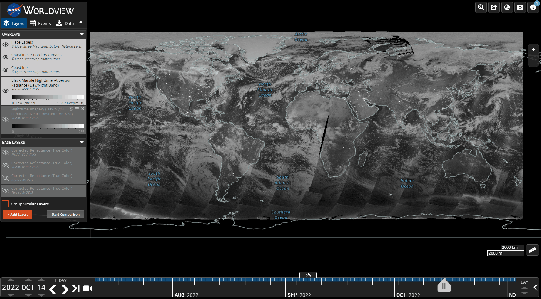
To directly visualize and test these hypotheses of large-scale and permanent changes, initially I had tried to re-use my existing geoSatView R functions to download the data via Zoom Earth or similar tools. However, some did not have the historical data or had a lot of cloud contamination that made both creation of a visually pleasing image and quantitative analysis a challenge. However, I still expanded geoSatView to include the use of EOSDIS Worldview (https://wvs.earthdata.nasa.gov) along with phantomJS and webshot (R package).
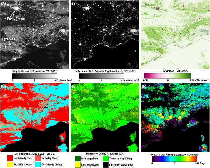
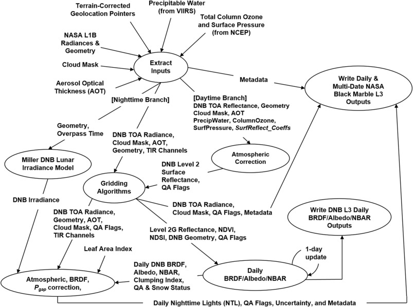
After looking through several available datasets, I settled on the VNP46A2 - VIIRS/NPP Gap-Filled Lunar BRDF-Adjusted Nighttime Lights Daily L3 Global 500m Linear Lat Lon Grid Black Marble dataset. This had several advantages in that researchers at NASA have combined data from multiple sources along with additional modeling to reduce various contaminates (e.g., cloud cover, atmospheric and moon-related effects, and more) that greatly increase the quality and consistency of the satellite data to allow for improved spatio-temporal analysis. Before diving into the results, I will briefly discuss how the Black Marble dataset was collected and created.
Background on Black Marble nighttime satellite datasets
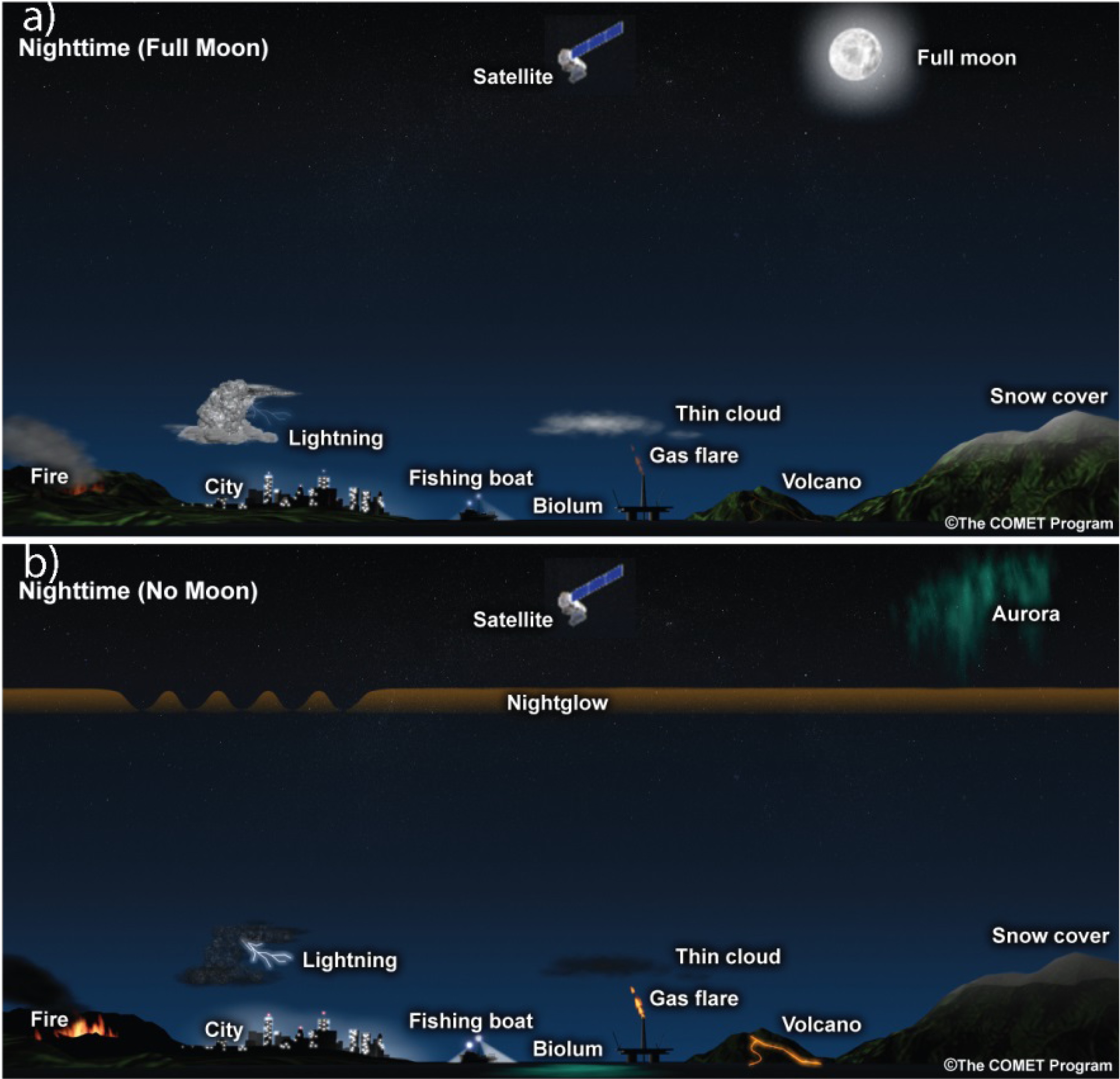
How do we quantitatively measure nighttime (anthropogenic) lights? As was noted in the prior section, the choice of dataset is critical for conducting proper analysis. In contrast to visualizing daytime with satellites, where the main source of illumination comes from the sun, at night there are multiple light sources of varying intensities that also depend on the phase of the moon (see figure above). Thus, light at night can be up to 10 million times fainter than reflected sunlight (Miller, 2013), requiring much more sensitive equipment to pick up visible or near-infrared (e.g. 400-900 nm wavelength) light that contains additional information beyond what would be provided by thermal infrared sensing.
This lead to the development of the Visible Infrared Imaging Radiometer Suite (VIIRS) sensor. This was incorporated into the Suomi NPP satellite (https://ncc.nesdis.noaa.gov/VIIRS/), which launched on Oct. 28th, 2011. The sensor covers a wide surface of 3040 km (GHRSST Level 2P SST v2.80 dataset from VIIRS on S-NPP Satellite) and can collect from wavelengths between 0.412 µm and 12.01 µm. Further, the Day/Night Band (DNB) can collect light from multiple wavelengths, from green (500 nm) to near-infrared (900 nm), that are relevant for detecting nighttime light pollution.
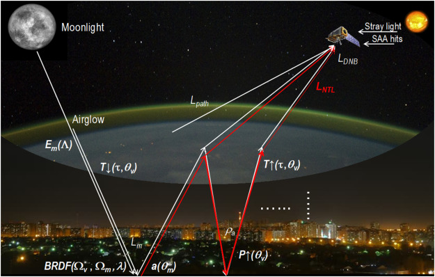
Once this data is collected, it will still contain many contaminants, such as clouds and moonlight, that preclude quantitative comparison of nighttime lights. Thus, researchers at NASA developed the Black Marble approach that incorporates different sources of light/illumination along with their angle, intensity, etc.; complexity of the surface being imaged; seasonal vegetation (e.g. due to changes in foliage); whether snow or clouds are present; and more. They can then correct for changes in illumination and thus allow for quantitative comparisons of nighttime lights across time and space. This cleaned up dataset is released as the VNP46A2 - VIIRS/NPP Gap-Filled Lunar BRDF-Adjusted Nighttime Lights Daily L3 Global 500m Linear Lat Lon Grid.
There is a detailed breakdown of the Black Marble datasets in the below papers and videos. As will be seen below, this approach produces superior images and make the resulting data easier to analyze and more visually pleasing, especially when creating time-lapse videos.
- NASA's Black Marble nighttime lights product suite
- Illuminating the Capabilities of the Suomi National Polar-Orbiting Partnership (NPP) Visible Infrared Imaging Radiometer Suite (VIIRS) Day/Night Band
- The NPOESS VIIRS Day/Night Visible Sensor.
- https://www.jstor.org/stable/26217142
- Discusses one of the sensors used in the
- Video on Black Marble dataset
- NASA ARSET: Black Marble Background, Use, and Applications, Part 1/1
- https://www.youtube.com/watch?v=KSxlhBLOAc4
The quality or availability of this data might change slightly based on the status of the Suomi NPP spacecraft (see https://land.copernicus.eu/global/content/sce-nhemi-product-s-npp-viirs-data-affected), see Case #:PM_NPP_L1B_22207 describing when the spacecraft ran into issues this summer. There is also large amount of unusable data especially in higher latitudes in Europe during late spring and summer months (e.g. see this in both 2021 and 2022). This caused both Ukraine and other parts of northern Europe to not have any data, so I removed those dates for visualization and analysis purposes.
Creating videos using the VNP46A2 VIIRS/NPP dataset (high-quality, cloud-free nighttime lights)
For the main, high-quality movie, I created them mainly using MATLAB along with several other tools. The following steps were taken using data provided by LAADS DAAC (Level-1 and Atmosphere Archive & Distribution System, Distributed Active Archive Center). I'm leaving out certain details, those can be looked at once I clean up the code and add it to GitHub. Most these steps can be combined into a single script/program in a single language along speed improvements by with skipping plotting data then frame grabbing before saving it, but for now it is spread across multiple programs.
The general idea is to download the data, combine the individual tiles, overlay each country's borders, highlight bodies of water, mark country of interest, create line plots to visualize change across time, and save the movie.
Web browser
- Go to https://ladsweb.modaps.eosdis.nasa.gov/search/order, select
VNP46A2Product, the date range of interest, and the tiles you want to include (e.g. most of Eastern Europe in my case). I normally selected tiles as this was more reproducible. - Download a CSV file with a list of tiles to download.
- Append
https://ladsweb.modaps.eosdis.nasa.govto all directories so you have the full URL path forwgetto use.
- Append
Terminal
- Use
wgetto download images in HDF5 format from https://ladsweb.modaps.eosdis.nasa.gov/.- Go to
Login->Generate Tokenwill allow you to download without having to enter username or password (as some R packages request). This is a common method for interfacing with online APIs for improved security. - For example, to download all files in a text file use
wget -i DOWNLOAD_LIST.txt -e robots=off -m -np -R .html,.tmp -nH --cut-dirs=3 --header "Authorization: Bearer TOKEN" -P .withTOKENbeing the token you obtained in the prior step andDOWNLOAD_LIST.txtcontaining a list of all files to download (tiles across time). - See https://ladsweb.modaps.eosdis.nasa.gov/tools-and-services/data-download-scripts/#wget.
- Go to
MATLAB
- Import all tiles into RAM, downsample each tile by 4x in each spatial dimension, and combine all tiles into a single large image of the region of interest (ROI).
- I use the
Gap-Filled DNB BRDF-Corrected NTL(units nWatts·cm−2·sr−1) dataset within each HDF5, see https://ladsweb.modaps.eosdis.nasa.gov/missions-and-measurements/products/VNP46A2/#overview. - At the same time, import the latitude and longitude coordinates from the metadata in each HDF5 file, these are stored in attributes within each file. Can use
h5infoandcell2structto convert them into a usable structure. - Can use my CIAtah MATLAB package to load and combine tiles then downsample them to a more usable format. Else use
h5readandimresize. If a tile is missing, place a blank (all zeros) tile in its place or skip that day.
- I use the
- Get the border for countries of interest (e.g. Ukraine) and use
poly2maskor similar function to create a mask and calculate the total intensity of light within Ukraine as well as for all non-Ukraine countries to use as a per-day global intensity control.- Note, it is easiest to scale each country's borders between zero and one then multiple by image dimensions to allow compatibility with quick matrix multiplication with images to get intensities.
- Plot the combined image with latitude and longitude coordinates.
- e.g.
imagesc(longitude,latitude,image);. Withlongitudeandlatitudebeing vectors specifying the actual lat/lon extent extracted from each tile's file metadata, e.g.longitudewould belinspace(westmostLon,eastmostLon,200). This is to ensure compatibility with coordinates used by borders and other GIS-based data. - All images are log2 transformed to allow for easier visualization and analysis. This is a common step in biology for datasets where values span multiple orders of magnitude, as is the case here.
caxiswas used to ensure the color limits are the same across all frames to allow for better visual comparison across time.
- e.g.
- Color bodies of water (e.g. blue) using a mask (e.g. adjust
AlphaDataof the image andColorof the axes) then add the current date determined from each file's metadata.- Bodies of water are generally near the maximum values allowed by 16-bit image files (e.g. 65,000+). Missing data is also of a similar value (e.g. many such tiles during summer 2022) and thus I used the January 1st, 2022 full map to calculate the bodies of water mask and used that for all subsequent images on the general assumption that bodies of water would not change drastically during the course of a year.
- Add borders for all countries.
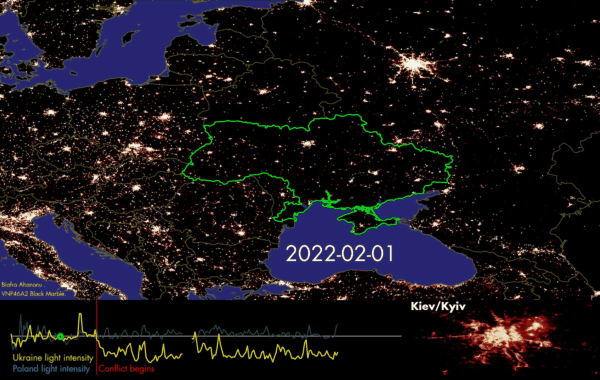
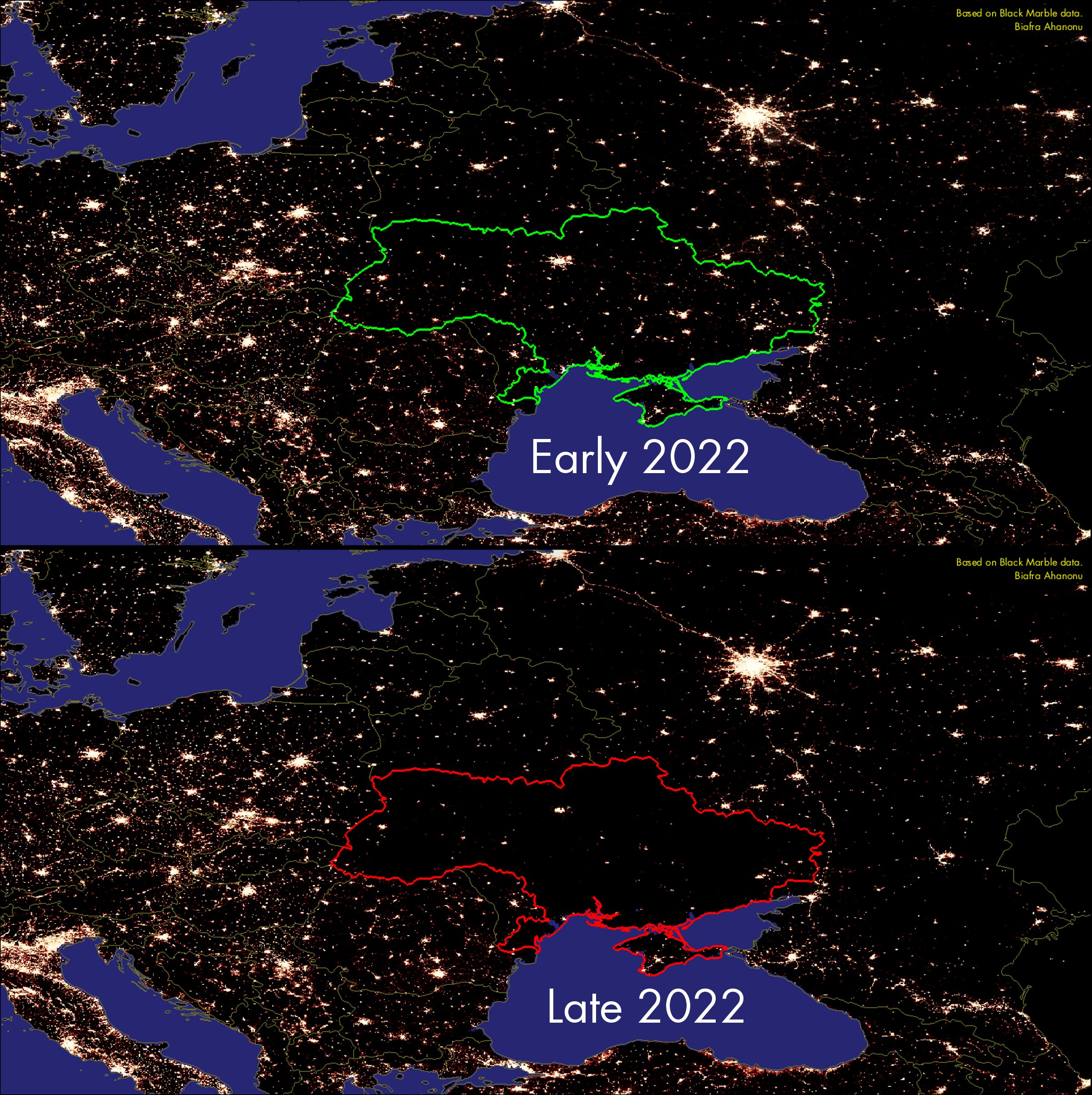
- The Ukrainian border is given special coloring depending on whether it is before (green) or after (red) February 24th, 2022 (e.g. pre- and post-conflict).
- I used https://www.mathworks.com/matlabcentral/fileexchange/50390-borders to get latitude, longitude coordinates for each country. Thus, the map includes borders for areas (e.g. Crimea) that are disputed. In future versions this can easily be corrected to make those locations grey or some other neutral color.
- Use
getframeandimresizeto capture the annotated maps and resize so they all fit into the same movie. - Export as multi-page colored TIFF file.
- To create a running line-plot of the intensity of Ukrainian area of the map (minus Crimea):
- I normalize the Ukrainian intensity by that of all other countries, this is to account for any full-field intensity changes over time along with any seasonal or other intensity changes that would affect most countries in the area evenly.
- As with the map, the dot indicating the current date is either green (pre-) or red (post-conflict).
- Export as multi-page colored TIFF file.
- To create the bottom-right zoomed in view of Kiev, I re-ran the above analysis but did not downsample from the raw satellite data, this allowed me to include the details of the changes in the capital at the full resolution provided by the
VNP46A2dataset. More observations on this detailed below.
ImageJ
- Import both files into ImageJ and combine into a single movie. Export as a AVI file, this can also be done from MATLAB directly.
- I removed data from April 20th to August 20th owing to the large increase in incomplete data for parts of Ukraine, Russia, and other countries. This is visually distracting for casual viewers and does not detract from the main message.
FFMPEG
- Convert AVI to MP4 using ffmpeg. Using MP4 as it is generally more compatible with many websites (e.g. Twitter) or programs (e.g. Slack).
- e.g.
ffmpeg -i FILENAME.avi -crf 10 FILENAME.mp4with-crf 10flag controlling the quality of the conversion, with lower numbers leading to higher-quality conversions (and larger file size).
- e.g.
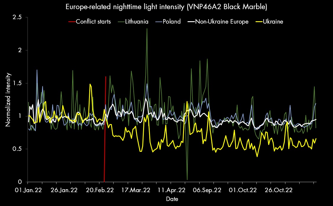
The resulting video is as displayed in the top of this section shows the pronounced change before and after the start of the conflict. This can also be visualized in the below graph, in which Ukraine's nighttime lights are compared to Poland, Lithuania, and non-Ukraine parts of the map. Once can readily see that right after the start of hostilities in February there is a decrease in Ukraine's nighttime lights that persist to today (November 30th, 2022).
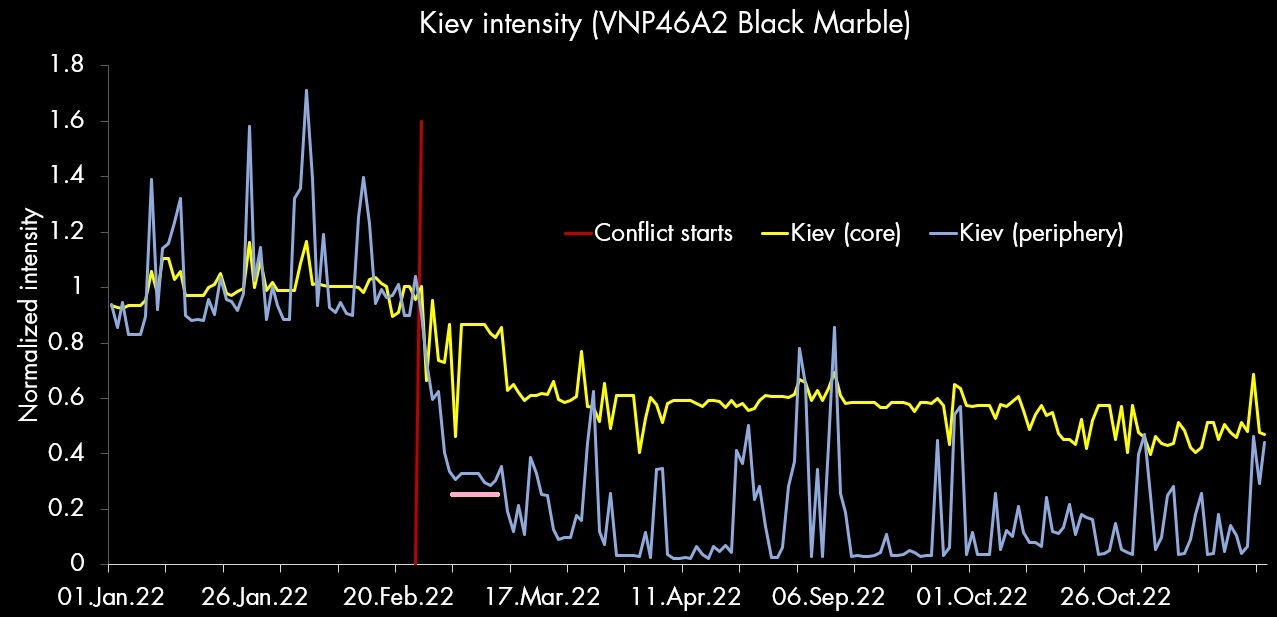
Further, one can see (below video) the difference in intensity for Kiev, the capital city, before and after the start of the conflict. In particular, there is a larger reduction in intensity farther out from the city core, within the outer neighborhoods or metropolitan area.
Graphing these results (below) can give hints as to when certain events took place, for example there was an additional reduction in the periphery around March 16th, which looks to correspond to new rounds of Russian bombing around that time (see Russia-Ukraine war updates for Weds, March 16 (CNBC) and Attacks on civilians intensify as Ukraine and Russia say negotiations indicate progress). However, further investigation is warranted, this just shows the ways this type of data can lead to identification of indirect measures of changes that are occurring on the ground.
Creating videos using the VNP46A1/Worldview dataset (lower quality with cloud and other artifacts)
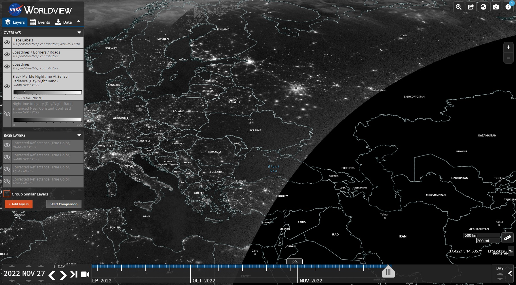
In contrast to the LAADS DAAC supplied VNP46A2 data, NASA has an interactive Worldview overlay for the VNP46A1 - VIIRS/NPP Daily Gridded Day Night Band 500m Linear Lat Lon Grid Night and Suomi NPP, VIIRS, Night Band (without corrections for lunar reflection, clouds, etc.) datasets. This can be useful for many users to get a quick sense for changes that are occurring in specific parts of the world, see below. In general the quality of these images is worse than those from VNP46A2 and at times the data appears lower quality (e.g. blurry, not just from artifacts). However, some of these datasets have better coverage during summer months compared to VNP46A2.
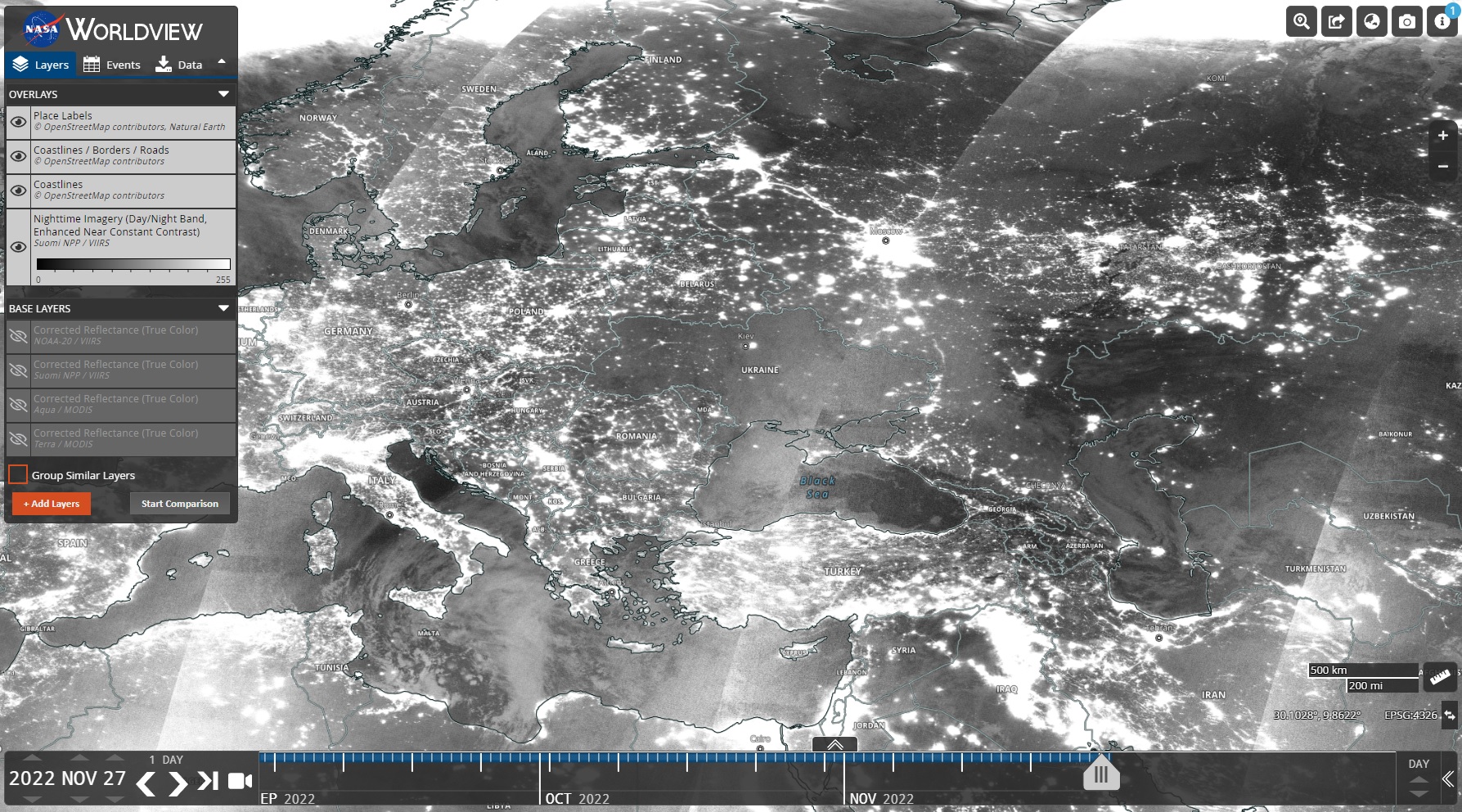
A further advantage of this dataset at the moment is that it can be downloaded without needing to create an Earth Data account. However, the downloaded images are RGB format, so information is lost and it reduces the ability to properly process the data due to pixel saturation and other artifacts. This can be ameliorated by downloading the HDF5 files from LAADS DAAC.
R
- Download images containing eastern Europe using EOSDIS, Worldview Snapshots, and geoSatView. I will show videos from two different datasets, geoSatView will be updated soon to include these features.
Suomi NPP, VIIRS, Day/Night Band, ENCC (Nighttime imagery)Suomi NPP, VIIRS, Day/Night Band, Black Marble At Sensor Radiance (Nighttime imagery)
ImageJ
The below steps are only done on the RGB downloaded data since the cloud mask and other data is not provided to remove certain artifacts.
- Drag entire folder containing downloaded images into ImageJ.
- This helps as it will label each frame with its corresponding filename that contains the date, which we will use later.
- Bandpass/highpass filter in the Fourier domain (remove 0-20 or 0-10 cycles).
- This is to remove large-scale intensity fluctuations represented by cloud systems and other artifacts.
- Background subtract (100 pixel rolling ball radius).
- Histogram normalization over all images based on the entire stack. See
Process->Enhance Contrast....- This is to improve the overall consistency between frames, as some datasets (such as
Suomi NPP, VIIRS, Day/Night Band, ENCC (Nighttime imagery)) have large changes in intensity of city lights between days.
- This is to improve the overall consistency between frames, as some datasets (such as
- Brightness and contrast adjustment to decrease dynamic range and make non-city areas black.
- Make image canvas larger then use
Image->Stacks->Labelto label each image with the date at the bottom. - Save as an AVI.
FFMPEG
- Convert AVI to MP4 using ffmpeg as in
LAADS DAACsteps.
VNP46A1 - Suomi NPP, VIIRS, Day/Night Band, Black Marble At Sensor Radiance (Nighttime imagery)
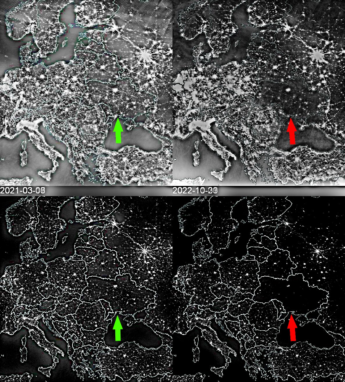
Overall, this video has fairly stable illumination and while the clouds can cause issues, there are enough clear days to make this usable. Notice the reduction in usable data during the summer months along with lost August 2022 data due to Suomi NPP entering standby mode.
Suomi NPP, VIIRS, Day/Night Band, ENCC (Nighttime imagery)
It can be clearly seen why even on the data archive page it does not recommend use of this dataset for any type of quantitative analysis and that it should be only used for qualitative or display purposes. However, due to the wide variations in illumination, I find this dataset to also be inadequate for creating visually pleasing qualitative movies.
Conclusions
I have gone over multiple nighttime lights datasets, where to find and acquire them, and different methods of visualizing/analyzing the resulting data. Using these tools, I was able to confirm that there was a specific and prolonged decline in Ukraine's nighttime light intensity, which is taken to be a proxy for either power/electricity availability or generation. Given there are questions of the exact correlation between certain other variables, such as direct daily measures of power generation, and the uneven distribution of pre-/post-conflict changes in nighttime lights in Ukraine (as I showed in the case of Kiev's core vs. periphery), in the future I would like to add additional information such as the layout of the electrical grid, location of power stations, and other information to give a more dynamic visualization of influencing parameters. The flexibility of using a programming language to create the visualizations is that you have full control over when everything is displayed and can change what is displayed based off of a variety of parameters and do so automatically while incorporating new data as it is released.
It should be noted that there are existing tools such as QGIS, GeoServer, and a host of other GIS software, see https://en.wikipedia.org/wiki/Geographic_information_system_software#Open_source_software. These have a long history of development and advantages in incorporating data and other standards into their processing and analysis. In fact, while at MIT we had investigated using these GIS systems to help identify city infrastructure in a city nearby Boston.
In future posts I will discuss these other tools and visualize the 2021 Texas power crisis, during which winter storms led to multiple and widespread power outages, along with other recent events around the world that have caused changes in vegetation and power availability or consumption. It is always exciting to see what we can do in the era of widely available big datasets and cheap computing power!
Notes and disclaimers
- I made the movies using a combination of
MATLAB(VNP46A2 dataset, minimal clouds) orR(VNP46A1/Worldview dataset, more cloud cover) along withwget,ffmpeg, andImageJ. - I am a biologist/neuroscientist by training, not a GIS researcher. However, this arose from my general interest in programming and using public databases to answer questions or create visualizations, including for topics outside my main field of study.
- The borders are those as supplied by
thematicmapping.org TM World Borders 0.3 datasetand I am making no statement regarding the sovereignty of territory marked by said borders. - For sake of clarity to visualize the night lights, I did not include country labels as it is not essential and Ukraine is already highlighted in either green (pre-invasion) or red (post-invasion).
- The running graph at the bottom is the pre- vs. post invasion mean intensity of Ukraine minus Crimea (on the assumption that electricity is not being systematically disrupted there due to being controlled by Russia).
- When I say
conflictorhostilitiesthroughout this post, I refer to the ongoing major military conflict that began on February 24th, 2022, see 2022 Russian invasion of Ukraine. I am not analyzing or discussing any low intensity warfare before that or the ongoing Russo-Ukrainian War that has been going on since 2014. - I am the source for all images, gifs, and videos (e.g. processed from data sources listed) unless otherwise stated.
- This work is not linked to NASA, LAADS, or other sources used, I only used their publicly available data.
Additional references and other code
Additional resources below that I will continuously update.
Beyond the tools I outlined above, there are some R and other packages:
- https://github.com/giacfalk/blackmaRble
- https://github.com/ptaconet/opendapr
- https://www.qgis.org/en/site/index.html - QGIS is a useful tool for
Additional interesting papers and links on remote sensing and Black Marble datasets:
- https://ieeexplore.ieee.org/document/9247100
- https://doi.org/10.1016/j.rse.2021.112557
- https://www.mdpi.com/2072-4292/5/12/6717
- https://www.jstor.org/stable/26217142
- https://appliedsciences.nasa.gov/join-mission/training/english/arset-introduction-nasas-black-marble-night-lights-data
- https://appliedsciences.nasa.gov/join-mission/training/english/arset-fundamentals-remote-sensing
- http://www.tandfonline.com/doi/abs/10.1080/13658810802634956 - An overview on current free and open-source desktop GIS developments.
- https://www.mdpi.com/2072-4292/14/19/4793 - A recent paper that performs similar analyses on changes in light intensity during the Ukraine conflict.
- https://iopscience.iop.org/article/10.1088/1748-9326/ac8b23/meta
Supplemental videos for all VNP46A2 VIIRS/NPP datasets
Below are supplemental videos using a similar method as outlined in Creating videos using the VNP46A2 VIIRS/NPP dataset (high-quality, cloud-free nighttime lights) for all the different datasets available in VNP46A2. This should give users a sense for what the different datasets look like and how they vary across time. All of the data has been log2 transformed and I adjusted the color scale to make it easier to visualize changes in each, since all the data have different valid ranges (however, within each video the color scale is kept constant across time).