bio42: diagrams, part 1

Summary

Had a couple minutes to spare before leaving lab, so decided to throw together some diagrams to help explain a couple biological pathways students of bio42, a bio class at Stanford I'm TAing. Hoping to make a set for each system we study. Started with vesicle budding and fusion along with muscle contraction in smooth and skeletal muscles.

Had a couple minutes to spare before leaving lab, so decided to throw together some diagrams to help explain a couple biological pathways students of bio42, a bio class at Stanford I'm TAing. Hoping to make a set for each system we study. Started with vesicle budding and fusion along with muscle contraction in smooth and skeletal muscles. The similar style, layout, and coloring is an attempt to demonstrate the similarity in pathways for students and allow them to get the basic components down. Many parts of biology boil down to understanding the basic framework of proteins being turned on or off then doing the same to some other protein, enzyme, metabolite, what-have-you downstream.

Diagram of vesicle budding and fusion.

There was a little difficulty in diagramming with a flow chart certain dynamic processes such as vesicle and target membrane fusion or the interaction of SNAREs along with their detachment by NSF and SNAP, but I think it captures the essential elements. In the future, I'll probably clean-up the style of the lines and choose a softer color scheme to make the diagram more inviting. Also, should probably just show more things that are in complex as being grouped together, but that might clutter the diagrams unnecessarily.

Diagram of vesicle budding and fusion.

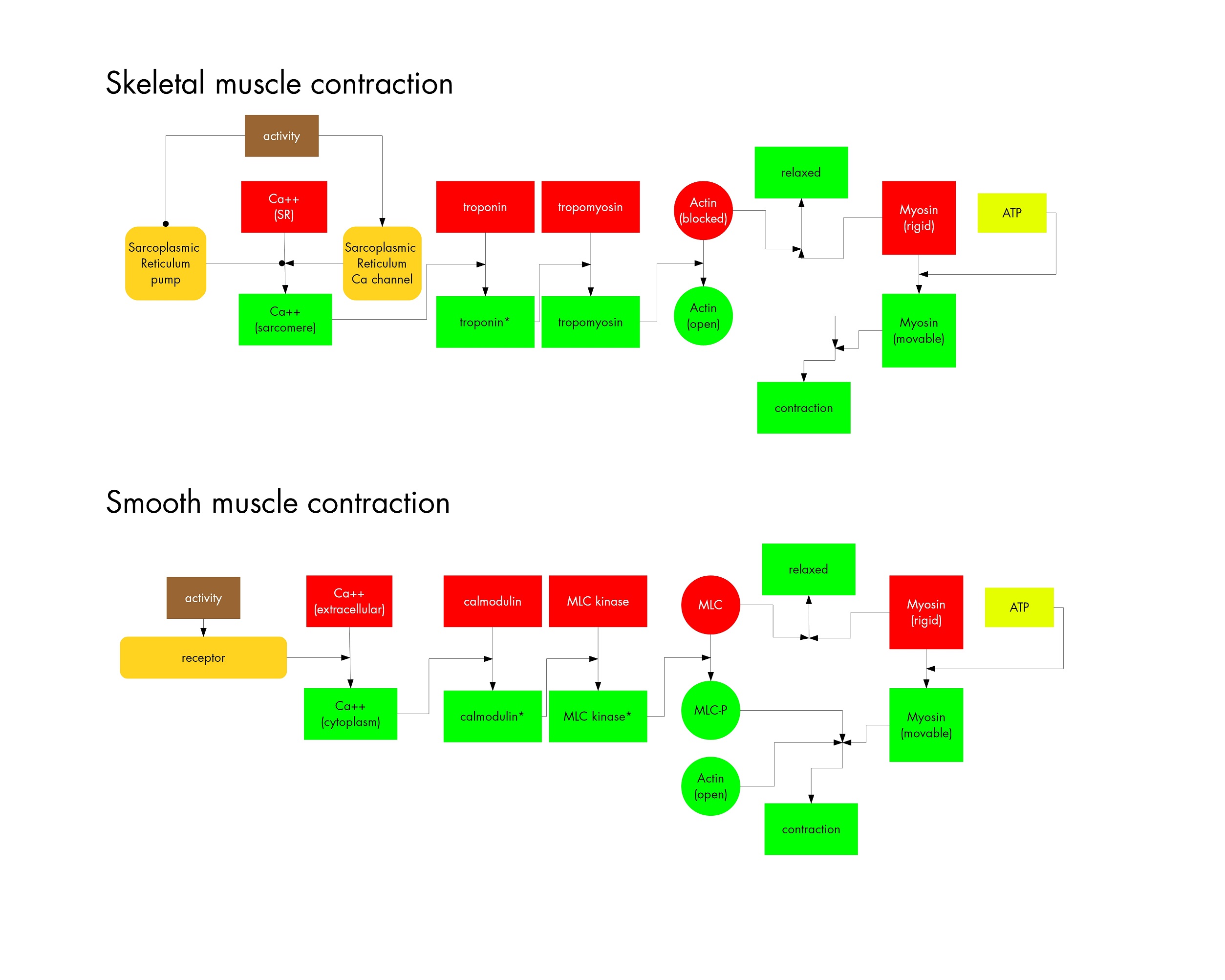
Muscle contraction was a little easier, but I greatly simplified the actual contraction step. Might make a separate diagram that details the coupling of ATP hydrolysis to myosin head movement. Regardless, looking forward to building out from here and adding protein trafficking, nuclear import and export, cell cycle, EGFR to MAPK signal transduction cascade and many more. Should be fun!

-biafra
bahanonu [at] alum.mit.edu

other entires to explore:

bio42: notes
12 may 2013 | teaching

While teaching bio42 (cell biology and animal physiology) I created weekly notes to help students in my section study and focus on the impo[...]rtant materials presented in the class. I built off of the latex boilerplate that I have been improving over time to create weekly notes. This highlights why I love LaTeX so much, especially for larger projects that are heavily linked—it allows easy annotation, indexing, creation of new document styles, and other related processes rapidly and consistently. Plus, separating content and style is always a plus and images stay uncoupled from a propriety source (e.g. Word files).

I really love the resulting notes and student feedback was quite positive. I thought sharing them might be useful for others in the future. The source latex files and raw images can be sent upon request (I'm considering making a Github repository in the future). I'll briefly talk about the document below and certain decisions that were made to get it to its current state.

janelia opening symposium
24 june 2011 | science

At the beginning of the Janelia Undergrad program we had to give a presentation on what we planned to do. It was a worthwhile experiences t[...]hat made one really focus on the different aspects of your project and get feedback.

satellite-based videos: eastern europe during the russia-ukraine conflict
30 november 2022 | satellite

To visualize the nighttime lights of Eastern Europe, with a focus on times before and after the ongoing Russia-Ukraine conflict, I updated [...]my geoSatView R code originally built to view forest fires in the west coast of the United States to use satellite data from VNP46A1 and other datasets collected from the Suomi NPP VIIRS satellite.

I then created higher-quality movies in MATLAB by using the VNP46A2 Black Marble dataset collected by the same satellite, which has reduced cloud and other artifacts due to additional data processing. This allowed me to quantitate a permanent reduction in nighttime lights within Ukraine (in line with my initial hypothesis) and identify a multi-stage reduction of nighttime lights in Kiev's outer neighborhoods/metropolitan area that was greater than that seen in the city core/center. This highlights the utility of public satellite data to quickly test hypotheses and visualize large-scale changes.

I will go over how the Black Marble dataset is collected and processed along with how I created the movies and the advantages/disadvantages of each data source.

Using this platform and codebase, in follow-up posts I will look at 2021 Texas power crisis during the winter storms, vegetation changes in deforested areas or after conservation efforts, and other events.

quantized art
28 may 2012 | essay

Quantized art. The idea came about while reading how the music industry assembles top-liners, producers, artists, performers, etc. to [...]create top 40 hits. For example, there has been a recent trend in pop music to use 'drops', when the song builds to a crescendo and then a crazy, catchy bass line is released that causes everyone to dance. This has been perfected to the point where even an okay song can become popular because the producers know when to build, at what moment to intersperse catchy, meaningless lyrics and how to end the song on a high. I like the idea that art (as in paintings, drawings, etc.) can be dissected and quantified.

My first pass at developing an algorithm to break art down to its details and then use this knowledge to generate art that people would consider 'great'. We'll see how this evolves.

©2006-2024 | Site created & coded by Biafra Ahanonu | Updated 17 April 2024
biafra ahanonu