 stanford
 linkden
 github
 goodreads
 medium
 twitter
The graphical abstract is an effective way to convey a complex message in an eye pleasing format that is easily digested. I wanted to create a neuroscience-based one as it would be an extension of my work with creating graphic designs and would take advantage of my current studies. From the initial, crowded to the final, clean abstract, I'll go through my thought process and provide links to useful resources.

The graphical abstract is an effective way to convey a complex message in an eye pleasing format that is easily digested. They are becoming more popular as more scientific publications (e.g. Cell) attempt to update their formats to suite the web. Written abstracts provide you the nitty-gritty details about whether you want to read a paper in-depth. On the other hand, a graphical abstract would (in theory) allow you browse many papers, understand the techniques and main findings, and then choose whether it is interesting enough to delve deeper.
In BIO 200 (called the nucleus, even though that structure itself plays a minor role...), my recitation explored a specific topic in neuroscience: how neurons use energy and what are methods to measure it. We originally read a paper (Lecoq, 2009) that dealt with the relationship between oxygen consumption and neuronal activity in the brain. This sparked us to consider how well BOLD (blood oxygen level dependent) signal, used as a marker for neuronal activity in fMRI scans of the brain, measured actual activity in specific regions of the brain. A literature search shed light on the ongoing debate in this field and the complex control of cerebral blood flow by a combination of astrocytic and neuronal products, among them lactate, nitrous oxide and arachidonic acid.
Because BOLD measures oxygen content and aerobic metabolism is the primary mechanism of energy production in the brain, we wanted to look at mitocondria, organelles that produce ATP (a cellular energy source), and whether their efficiency at converting glucose to ATP differed across brain regions. This would allow us to say, as a first pass, whether some mitocondrial efficiency function could deconvolve the BOLD signal to give a picture of actual neuronal activity across the brain. Kind of what is done with point spread functions to deconvolve confocal and other microscopy images.
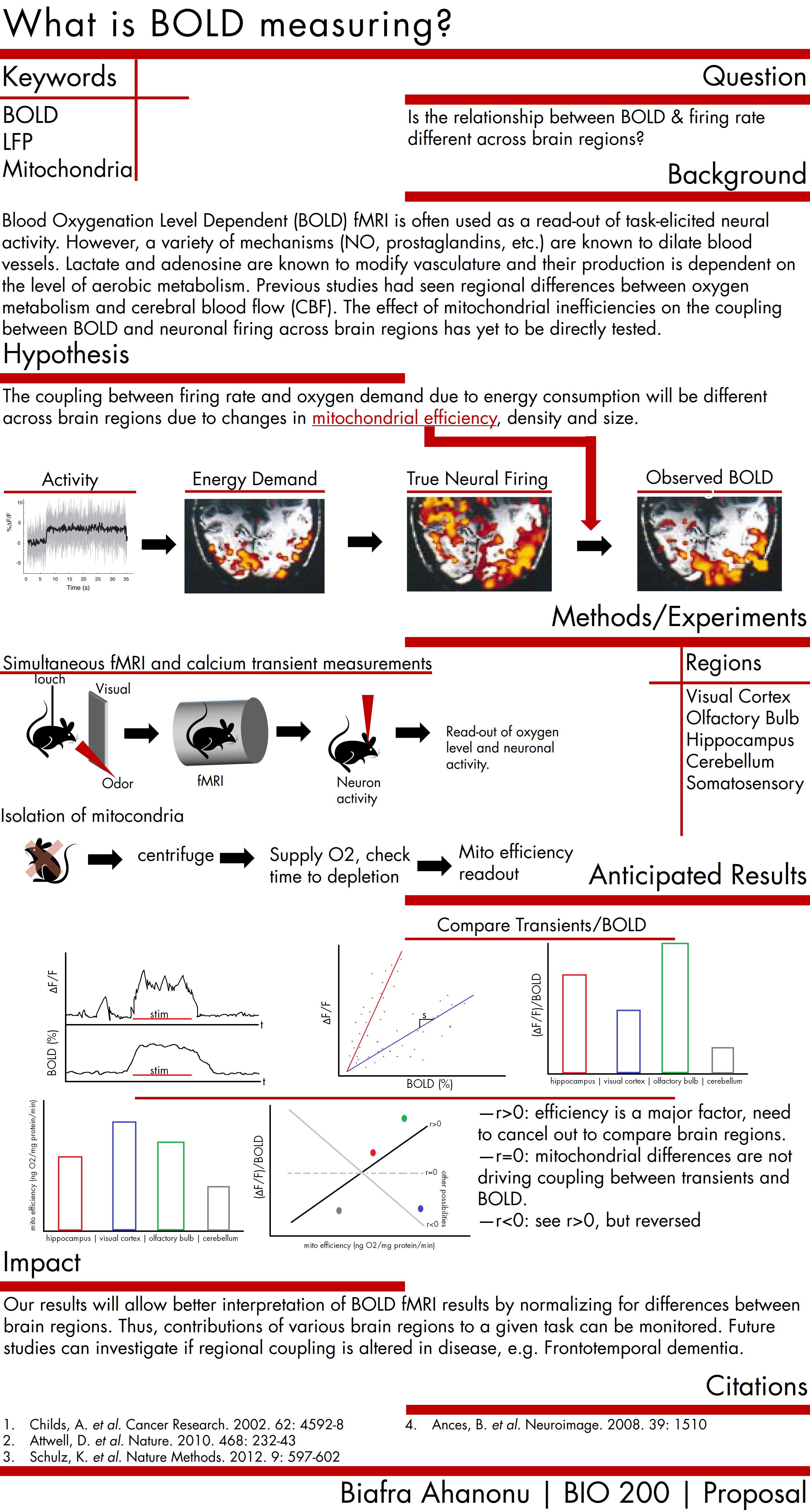
The initial attempt at a graphical abstract was heavy on text and bordered on a poster rather than a concise, eye-pleasing abstract (fig. 1). During recitation, we went over each others' abstracts (everyone else had written ones) and discussed what could be improved. Overwhelmingly my teammates suggested I cut out as much text as possible, increase the number of graphics and re-organize the layout. Before plunging ahead blindly, I did a little research.
Several publications have pages where they list criteria to be included in a good graphical abstract. Cell has a couple pages (see: Cell Reports and Cell) that include guidelines along with several examples. For good examples of something akin to a graphical abstract, Cell also has their SnapShot archive, which has many excellent graphical explanations of complex biological processes (e.g. circadian clock proteins or Nonhomologous DNA End Joining) presented in a informative yet readable manner. Best of all, they contain well-crafted images that convey the point and often you don't even need to read the text to understand the content, though it provides helpful supplementary information.
In addition, Elsevier, a scientific journal publishing group, has provides several useful resources: some good examples and a graphical abstract overview.
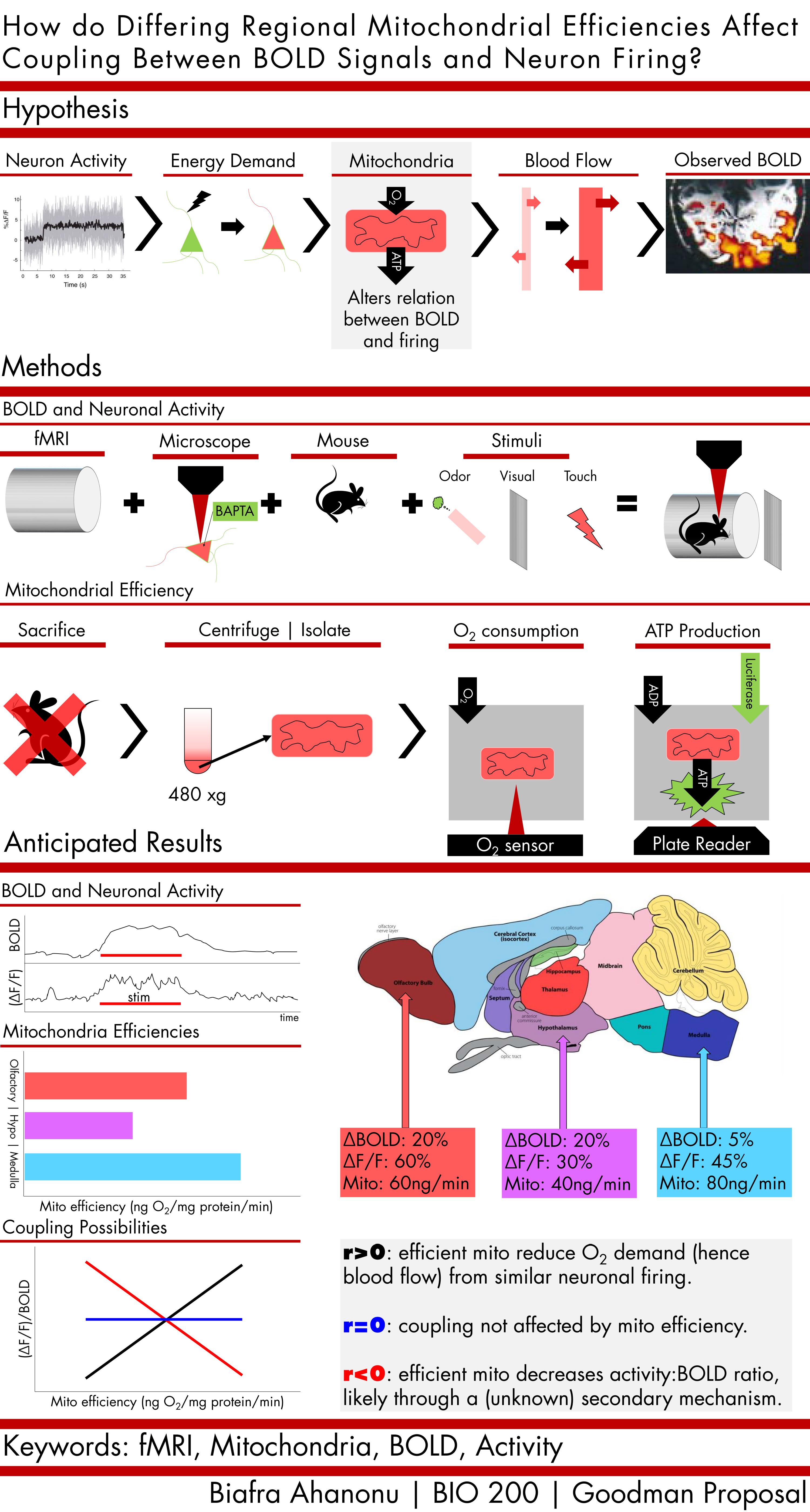
After reading these and other documents along with looking over several abstracts in actual papers, I decided to revise the content and a bit of the style (fig. 2). The audience was clarified: this was meant for practicing scientist and not necessarily the general public, so a lot of background could be omitted. Softening the palette of the graphic may catch less attention if it was an ad, but people generally prefer not to look at high contrast content for very long. The range of colors was also increased, the variety helps catch attention and also provide a contextual thread that links concepts across the different subsections.
Instead of a eye-catching, yet confusing, placement of the titles on the right-side, I aimed to conform to English's tendency for left to right reading (unlike what Apple tells us, thinking different isn't always good). Shifting the keywords to the bottom avoid them hogging the initial attention, but giving them a title sized font allows someone browsing to find them quickly. The flow of the abstract is made easier by a top-bottom organization of sections and left-right organization of content within each section.
The background and conclusion sections are completely removed as they are unnecessary, the graphics themselves should tell the story. The background in integrated into the hypothesis while the conclusion, or proposed conclusion, can be inferred from the anticipated results. There is an explanation near the end about possible results; after further revision this might be removed to avoid any confusion caused by an overly short conclusion that might miss central themes and leave the reader with half-truths.
As much as possible, I created my own graphics with a particular style. I aimed for a flat, basic illustrations to help the reader associated particular concepts with certain shapes and colors (e.g. mitocondria are always red). Also, it saves time, haha.
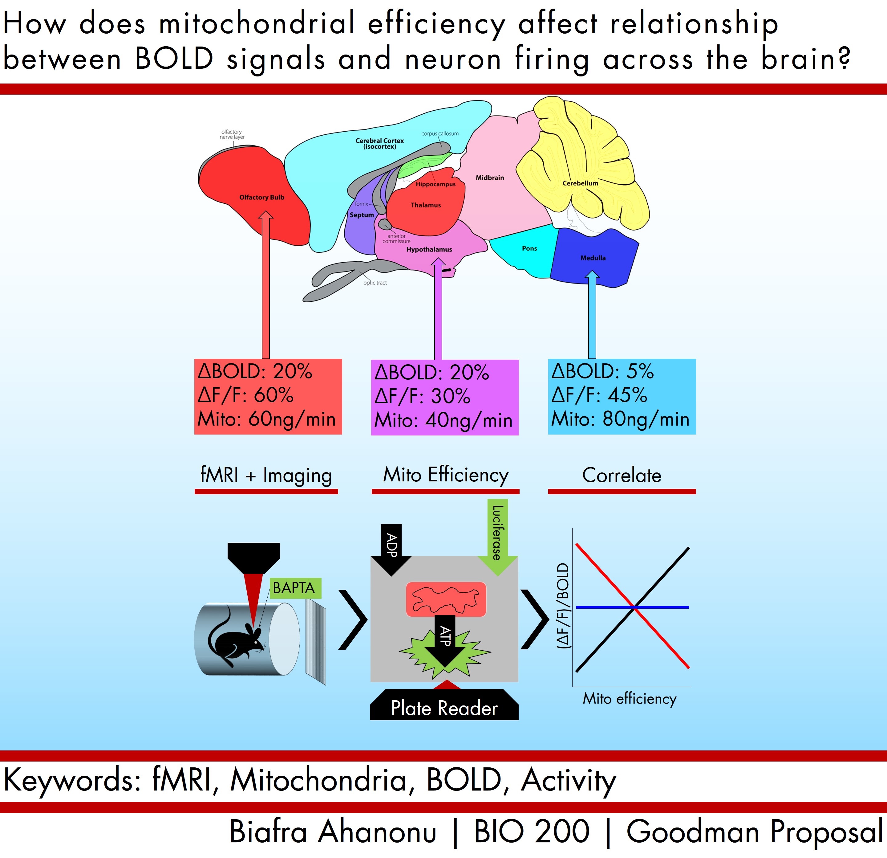
There are several areas of improvement. Namely, it would be nice if about 50% of the text could be removed and replaced by better graphics or more logical organization. One method would be to use color gradients to guide the reader or more detailed graphics in the case of the fMRI and microscope. The abstract could be greatly tightened by making the brain a central figure, then having the different efficiencies converge on the two methods used to make them along with an extremely brief figure on conclusions. This would reduce the figure to a couple of images and would be much easier to digest. Looking at the final revision, we see a much clearer abstract that captures the essence of the idea without bogging down the reader (fig. 3). There are areas for further improvement, but that can wait till next time!