 stanford
 linkden
 github
 goodreads
 medium
 twitter
While teaching bio42 (cell biology and animal physiology) I created weekly notes to help students in my section study and focus on the important materials presented in the class. I built off of the latex boilerplate that I have been improving over time to create weekly notes. This highlights why I love LaTeX so much, especially for larger projects that are heavily linked—it allows easy annotation, indexing, creation of new document styles, and other related processes rapidly and consistently. Plus, separating content and style is always a plus and images stay uncoupled from a propriety source (e.g. Word files).
I really love the resulting notes and student feedback was quite positive. I thought sharing them might be useful for others in the future. The source latex files and raw images can be sent upon request (I'm considering making a Github repository in the future). I'll briefly talk about the document below and certain decisions that were made to get it to its current state.
For those who want to dive right in, the notes are found at:
bio42 notes: winter 2013
or
bio42_winter2013_biafra_notes.pdf
intro

While teaching bio42 (cell biology and animal physiology) i created weekly notes to help students in my section study and focus on the important materials presented in the class. I built off of the latex boilerplate that has been improving over time to create weekly notes. This highlights why i love LaTeX so much, especially for larger projects that are heavily linked—it allows easy annotation, indexing, creation of new document styles, and other related processes rapidly and consistently. Plus, separating content and style is always a plus and images stay uncoupled from a propriety source.
I really love the resulting notes and student feedback was quite positive and thought sharing them might be useful for others in the future. The source latex files and raw images can be sent upon request (i'm considering making a git repo in the future). I'll briefly talk about the document below.
typography
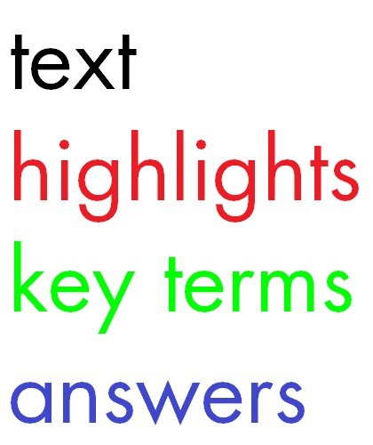
These notes were an experiment in incorporating beautiful typography into what are otherwise mundane works. The latex boilerplate gave me the template and i ran with it. I continued to use red, black, and white as the anchoring colors for the theme but eventually added blue (answers) and green (key terms) to help flesh out the colour palette and provide more easily distinguishable identifiers. Originally, key terms were grey, which works well for saving ink, but is hard to distinguish on print-outs or on the screen (especially if the contrast or brightness are abnormal). With the answers, i originally had them in red, but found this screamed to students "if you were wrong, this is the right way to do it". Essentially the mood that grading in red ink conveys. I wanted to avoid this while staying far away from colours that are too soft and hard to see (yellow, orange, pink, etc.). Thus, blue was the only viable option left. To ensure maximum visibility across uses and devices, i kept all colours primary.
The font used throughout the text was Future Std Book, which is a wonderfully versatile font (as you'll probably note, i also use it for header text throughout this site). The main reason for choosing Futura over the more standard Helvetica, Times Roman, Arial, Comic Sans (god forbid), or a variety of others is due to the familiar-yet-foreign feel (it is used, but not as often) along with the cleanness of the lines. Further, and several students noted this, it assures them that i thought about the creation of each handout instead of copy-n-pasting as others sometimes do. This wasn't only true in appearance, but also in practice—i read and synthesized rather than simply transplanting others' work.
Consistent use of a single font brought forth other issues, namely sectioning the content. Many use a complementary font for headers if their main text is a single font, and in the case of a predominately serif document, this would ask for a sans-serif (to produce the necessary contrast). However, i envisioned this document to be computer-centric to a degree and i have a slight bias toward sans-serif fonts outside the printed realm. Not wanting to introduce the added coding, visual, and typographic burden—finding a matching sans-serif, kerning and aligning it properly, etc.—i instead went for the more reliable changing of size. This was extremely consistent and allows rapid browsing of the document to locate key sections then narrow down from there. Maybe in the future, after a bit more reading on balancing the stroke widths, x-heights, kerns, history, and other aspects of various serif and sans-serif fonts, i'll start introducing another font to complement the main body text.
organization
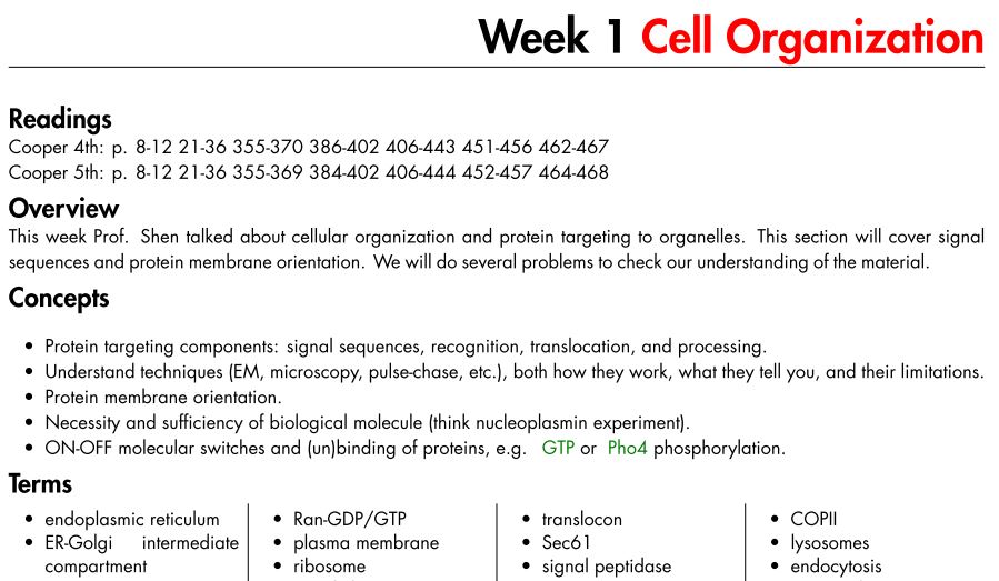
The notes were organized on several levels to help easy browsing, with a focus on those using the document on the computer. The table of contents included links not only to the main chapters but several select sub-sections as well, which can help orient first-time users. Each week has the same layout: title, readings, overview, concepts, and terms. The concepts and terms were key for me—they are useful for studying (a student noted it was especially useful for the final) and making sure you understand the big picture. I always included problems and figures last, partially because the separation of images and texts allow saving of ink (sometime you only want the text).
terms
The terms lists and key terms evolved as the semester progressed. I definitely recommend future TAs include these first, as most students remember by memorizing and terms can help jog the memory and set them on the right path before diving into the details. I began to sub-section the terms by topics covered during that week, this allow even easier browsing and i will update old weeks in the future to account for this. Because i often created the keywords while reviewing material, there was a tendency to include topics that weren't directly discussed in class. This made the notes more comprehensive but may have lead to some student confusion about what exactly they needed to know. This will be altered such that additional terms are located at the end of each week, for students who want to know more.
section overviews
These ended up involving a very short summary of the week and letting students know what direction the discussion sections would take. In the future i might consider expanding these to include a better overview, but the concepts section takes care of this duty quite well—plus students find reading bullet points easier than text.
problems

The type and difficulty of the problems waxed-n-wained over the semester depending on how much time i had to create new ones or modify old ones. Also, for the neuro or other topics that i am more familiar with, i could often make them up on the fly based on questions students asked after class or during recitation. The textbook and materials from classes at MIT helped flesh out the type and style of questions. On the next go-around, i aim to have more involved, multi-part questions—especially for physiology, where there was a tendency toward multiple-choice style questions, which i have a particular dislike for.
figures
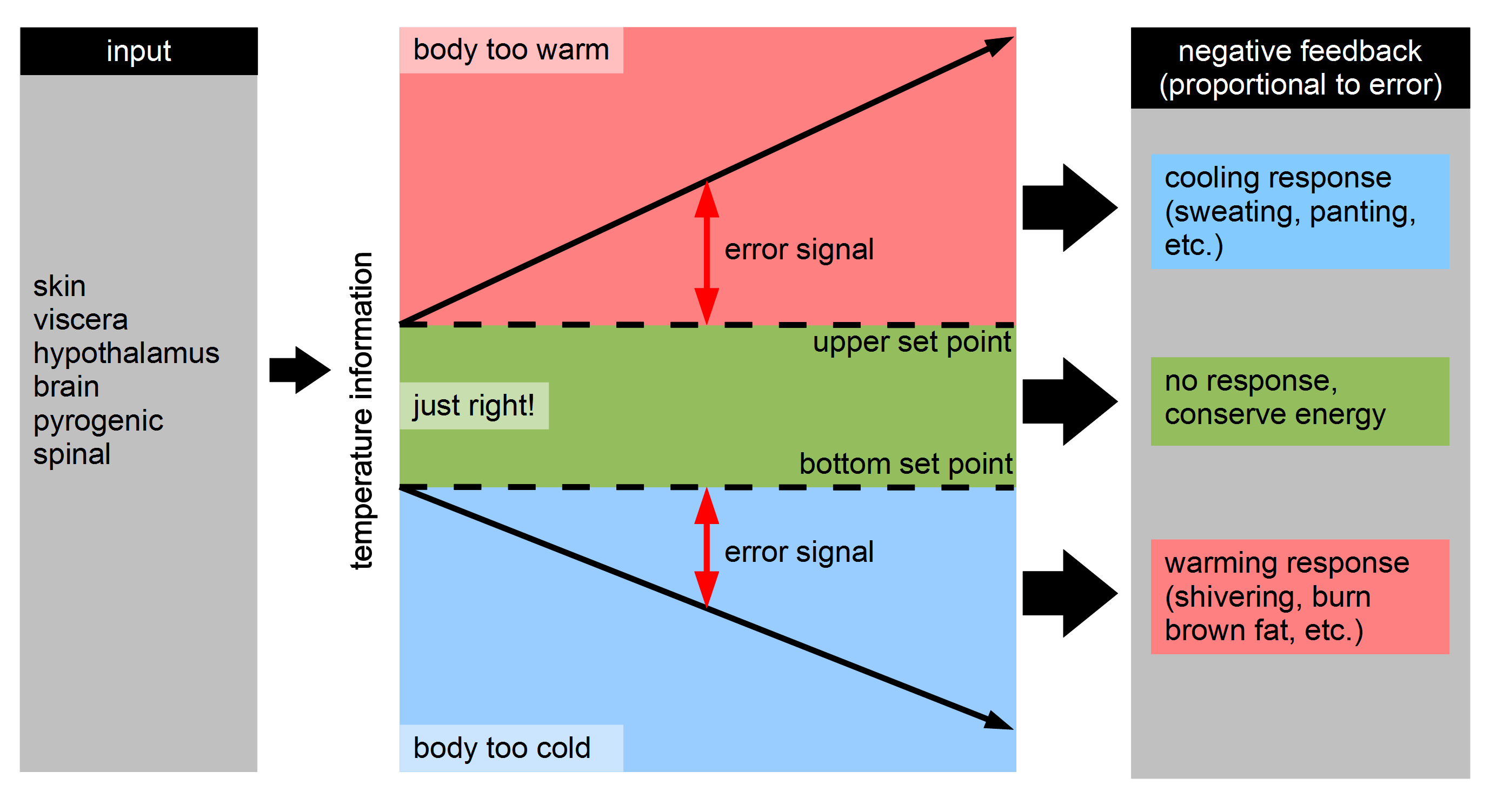
I purposely put the figures last, partially to allow printing of the images separately for use when studying but also as a stylistic choice to reduce overall clutter when reading. The first revisions of the text heavily used inline images, but it broke the flow of the content. This was especially true as i switched to a more bulleted style–there would be a lot of awkward line breaks, incorrect floats, and other problems. Further, because of the systematic numbering, descriptions under each image and ease of referencing them in the text, i felt the added burden of including them inline was not worth it. Plus, separating the images also saves a ton of ink, if the student (or i) want to print just the notes, we don't have to do anything fancy to avoid using a lot of ink of colour heavy diagrams. Another advantage of having them last was that i could easily comment out figures irrelevant to that week's discussion section, but which were useful for exam study, and compile two separate versions of the handout, as noted below.
equations
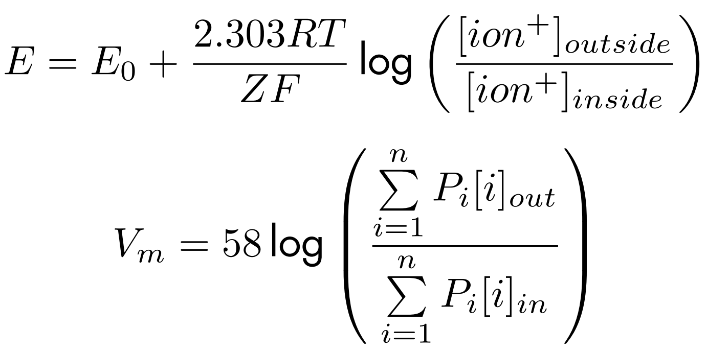
The course was fairly light on equations, but i decided to compile many of those that were helpful in understanding the basic concepts, such as the Nernst and Goldman equations in the case of neurobiology. This aspect of the course should likely be beefed up, as describing many of the systems with even basic math would help in understanding what should happen when you manipulate the system. This include having more exam questions that involve even a modicum of mathematical problem solving (or just simple plug-n-chug).
appendix

The appendix ended up being a repository of useful material that i didn't feel belonged elsewhere. Certain bits, such as biological scales and similar, were not part of the main content of the course and were left there. For the first time teaching this class, the appendix wasn't as involved and useful as i first intended, in the future i will expand upon it by drawing in more material from past classes they should have taken.
conclusions
Overall, there are several things i learned and plan on improving. The style and form of the notes is quite important and itself conveys a sense of authority. Students commented that they hadn't seen such organized notes before—in any of their classes—but that at times they were a bit intimidating for recitation. This lead me to create two different versions of the notes: a barebones version (concepts, terms and problems) for recitation and a more beefed up copy to post on the course website. Because LaTeX allows macros that can be globally altered, this made compiling the two different versions rather painless, only a line or two of code had to be commented and voilà! i had two copies. Lastly, i would really love to expand upon references to primary articles in future versions, especially for students interested in pursuing science as a career.